The post will walk you through The Psychology of Colors; How To Choose the Perfect Color Pallete For Your Home
I had wanted to repaint my physical office for what felt like forever, but I never had the spare time to call a painter.
Between juggling taking care of my twin toddlers, back-to-back meetings, and handling the office workload, especially with new clients coming in almost every day, there was barely time to think, let alone plan the beautiful office makeover I had in mind.
My spouse, who’s definitely the more creative one, suggested we repaint the office ourselves. I loved the idea instantly.
I had secretly been itching to try my hands at painting, just to get the tiniest bit of experience and know how it feels to repaint a space on my own.
So, we made a plan and walked into the nearest paint store one cool day, feeling all excited but a little unsure.
The moment we stepped in, we were greeted by walls lined with tiny paint samples, filled with so many shades of white, grey, beige, and everything color.
It was like being in a sea of colors that all looked just a little too similar, yet somehow totally different.
The colors you choose for your home, kind of decide the mood of your home.
If you want your bedroom to feel peaceful, you have to go with calm tones.
If you want your living room to feel fun and lively, try something brighter like blue. It’s not just about what looks pretty, it’s about how it makes you feel when you walk in.
Why the right color palette matters you may want to know, right?
Picking the right colors for your home isn’t just about making things look cute.
It affects way more than you’d think. Did I mention I repainted the my office reception lavender, because most people said it help with creativity and inspiration and ofcause I always want my team to come up with new and better ideas for the company.
The right color firstly, sets the mood. The colors on your walls and furniture can make your space feel calm, comforting, fun, moody, fresh, you name it.
If you get the vibe right, your home will feel like you. If not, it can feel off, even if everything is styled nicely.
Also, it helps with flow. When colors work well from room to room, everything feels connected and easy on the eyes.
It’s actually all about keeping things feeling like each room is part of the same story. A good palette ties it all together.
Choosing colors is fun, but it also has a real impact on how your home feels, how it functions, and even how much it’s worth later on.
How To Choose the Perfect Color Pallete For Your Home
1. How to Pick a Color Palette for Your Home

Picking a color palette for your home is more than just a fun design task, trust me, I understand what it feels like.
It’s a chance to create a space that reflects your personality, boosts the mood you want, and even increases the overall ambience of your home. But with so many options out there, it can feel so draining and overwhelming.
So, how do you go about making the right choice?
- . Start By Figuring Out Your Style
The first step in picking the right colors is knowing what vibe you want for your home. Because you alone know yourself better.
Do you love that clean, simple feel of modern design with lots of open space? Or maybe you’re drawn to the cozy, classic look of traditional styles?
Or you all about the boho vibe, mixing fun patterns and easy going energy? Once you get clear on your style, choosing colors becomes way easier and helps make your space feel like it truly belongs to you.
- Look At Fixed Elements
Start by thinking about what can’t be easily changed, like your floors, countertops, and big furniture pieces.
These things will guide your color choices. For example, if you have dark wood-colored floors, you might want to go with lighter wall colors to even it out.
If your countertops are marble with gray tones, softer colors on the walls can help them pop.
Big furniture, like a bright-colored sofa or patterned rug, can also affect your choices. If the pieces are bold, you might want to keep the walls more neutral to avoid too much going on at once.
These fixed elements set the stage for your color palette. Choosing colors that work with them helps everything feel more put together and comfortable.
And don’t forget to think about the undertones of these pieces (like warm or cool shades) to make sure everything flows smoothly.
- Get Inspired From Nature Or Fabric Patterns:
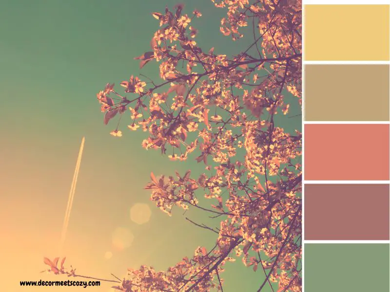
Look to nature for color inspiration. From the soft greens of a forest to the calming blues of the ocean or the warm tones of a sunset, nature offers beautiful color combinations.
You can also find ideas in fabric patterns, like the colors in a cozy throw pillow or a piece of artwork. These elements can help guide you to a palette that feels calm and balanced.
Drawing from nature or patterns you already love adds a personal touch to your space. For instance, pairing soft green with earthy neutrals creates peace, while deep blues with sandy beiges offer a relaxing coastal vibe.
Using these natural combinations ensures your colors complement each other, creating a harmonious, easy-on-the-eyes home.
- Tools And Apps That Help You Visualize
There are some great tools and apps out there that let you see how different colors will look in your space before you commit. Apps like Pinterest and Instagram are also great for seeing how others have used certain colors in their homes. Some paint brands like
- Paint Tester – It lets you visualize different wall colors and test how they’ll look in your room. You can also match colors to your existing decor.
- Sherwin-Williams ColorSnap Visualizer or Behr’s ColorSmart are perfect for this. Both apps allow you to upload a photo of your room and try out different paint colors virtually.
This way, you can get a real sense of how the color will look in your space without the hassle of painting first.
You can even test out multiple shades to find the perfect one. These tools can save you from second-guessing your choices and help you feel confident about your decision.
2. Build Your Color Palette Around Neutrals
When figuring out How To Choose the Perfect Color Pallete For Your Home, starting with neutrals is a smart choice.
Neutrals act as the foundation for any room, giving you a versatile and timeless base to build on. They create a sense of calm and balance, allowing other colors to shine without overwhelming the space.
Common neutral tones include soft whites, gentle greys, beige, and warm taupes. These shades can blend easily with almost any style, from modern to traditional, and are perfect for creating a balanced, harmonious atmosphere in your home.
While neutrals are great on their own, they also pair wonderfully with bolder accent colors.
For example, you can use a neutral wall color, like light grey or soft beige, and add pops of a deeper color, like navy blue, forest green, or burnt orange. This mix adds depth and interest without making the room feel too busy.
By sticking to neutrals as your base, you give yourself the freedom to play with colors in small doses while ensuring that your palette remains balanced and timeless.
3. Consider Your Home’s Architecture & Features
When choosing a color palette, it’s important to consider the style of your home.
The architecture and overall design influence how certain colors will look and feel in your space.
For example, a modern home with clean lines and open spaces might look best with sleek, minimal colors like whites, blacks, or greys.
On the other hand, a traditional home with rich wood features might benefit from warmer tones like deep browns, cream, or muted greens.
Permanent features such as floors, cabinets, and countertops also play a major role in shaping your color choices.
If you have hardwood floors, you may want to stick with neutral tones that complement the natural wood.
For homes with marble countertops or sleek cabinetry, you might choose colors that enhance the elegance of these features without clashing.
4. What Decorating Style Never Goes Out of Style?
Some decorating styles remain timeless, and their versatility makes them ideal for creating a lasting color palette.
- Classic Traditional: This style adds rich wood tones, elegant furnishings, and soft, classic color palettes like warm whites, beige, and muted jewel tones. These colors never go out of style because they are grounded in traditional design principles that have stood the test of time.
- Mid-Century Modern: Known for clean lines and functional design, mid-century modern homes often feature bright, bold colors paired with neutral backgrounds. Soft yellows, teal, and mustard work well with the natural woods and minimalist furniture that define this style.
- Scandinavian: With its focus on simplicity and light, Scandinavian design embraces light neutral tones like whites, greys, and light blues. This style uses color to create a serene and cozy environment, making it perfect for homes with natural light and open spaces.
- Minimalist: Minimalism is all about less is more, and that philosophy applies to color as well. Neutral colors such as white, black, and grey dominate, creating calm and uncluttered spaces. The beauty of minimalist design lies in its ability to highlight simple, elegant details while keeping the overall palette subtle.
Why These Styles Endure and How to Complement Them
These styles remain popular because they create spaces that are both functional and aesthetically pleasing. They’re not tied to short-lived trends but instead focus on creating harmony and balance.
When choosing a palette for these timeless styles, stick with colors that enhance the natural beauty of your home’s architecture and features.
If you choose soft neutrals, muted tones, or subtle pops of color, your palette should always support the overall feel of the space, allowing the design to shine through without overpowering it.
5. Consider Lighting and Room Functionality
Lighting greatly affects how colors appear in your home. A color that looks soft in a sunlit room can feel dull in a dimly lit space.
Consider the natural light in each room and the type of artificial lighting you use. Rooms with lots of natural light make colors look brighter, while darker rooms with warm lighting can make colors appear deeper or warmer.
Always test paint samples on your walls to see how they change throughout the day. Colors can look different in the store than in your space.
For a relaxed feel in bedrooms, use soft tones like muted blues or greys. In kitchens or offices, energizing colors like warm whites or cheerful greens can keep the space bright and motivating.
Matching your colors to the room’s purpose helps create spaces that are both beautiful and functional.
6. Select Timeless Furniture Choices

Choosing the right furniture is just as important as picking the perfect color palette for your home. The two should work together to create a space that feels balanced, inviting, and timeless.
When you invest in furniture that stands the test of time, it becomes easier to refresh your space later without having to start from scratch.
Neutral-toned or natural materials like wood, linen, and leather pair beautifully with most color palettes.
These materials act like visual anchors in your home and create a strong foundation, allowing you to change wall colors or accent pieces over time without clashing.
What Style of Furniture Never Goes Out of Style?
Some furniture styles have proven they can outlast trends. These classics continue to be loved because they’re well-made, functional, and easy to mix with different decor styles and color schemes:
- Mid-Century Modern: Known for its clean lines, tapered legs, and functional design, this style remains popular across generations. It works well with both bold and soft color palettes, making it easy to blend into different rooms.
- Farmhouse Pieces: With their cozy charm, distressed finishes, and sturdy wooden builds, farmhouse-style furniture pairs wonderfully with warm neutrals, whites, and muted greens. Their casual yet elegant vibe fits well in both traditional and contemporary homes.
- Solid Wooden Furniture: Natural wood furniture if it’s oak, walnut, or teak—has a timeless quality. Wood tones add warmth and texture to your palette and suit everything from minimalist to rustic spaces.
- Slipcovered Sofas: These are both stylish and practical. Their relaxed look works in almost any design style, and the covers can be removed, washed, or swapped out, which means you can update the look without replacing the entire sofa.
When choosing furniture, go for pieces with classic shapes, quality materials, and neutral upholstery.
These can evolve with your style and adapt to new trends through accessories like pillows, throws, or even a fresh coat of paint on nearby walls.
The key is flexibility let your big furniture pieces stay timeless, and have fun updating the smaller details as your tastes change.
7. Use Accent Colors Wisely
Accent colors are the little touches that bring your space to life. They add personality and style, but only when used wisely.
The goal is to let these colors enhance your home, not overpower it.
Start with a neutral base, like soft whites, greys, or beige. This creates a calm and timeless feel. Then, add accent colors through smaller, easy-to-change items like throw pillows, rugs, curtains, art, or decor pieces. This keeps your main colors consistent, while your accents add a fun pop.
Bold colors like navy, emerald green, burnt orange, or mustard yellow can make a room exciting. But when paired with neutral walls and furniture, the room feels balanced and cozy.
Limit yourself to one or two accent colors per room to keep things simple and calm. Repeating these accents throughout the room—like matching a vase to a throw pillow—helps tie everything together. And if your style changes later, you can easily swap out your accents without redoing the whole room.
By following these tips, how to choose the perfect color palette for your home becomes easier, helping you create a space that feels comfortable and uniquely yours.
8. Use The 60-30-10 Rule
The 60-30-10 rule is a simple trick many interior designers use to make sure a room feels balanced and pulled together. It helps you divide colors in a way that looks natural and easy on the eyes.
Read this:
- 60% of the room should be your main color – It should be usually a neutral tone like white, beige, or soft grey. This covers big areas like walls, large furniture, and floors.
- 30% should be your secondary color – This is something that supports your main color but adds more interest, like a darker grey, navy, or soft green. This could be used on accent chairs, curtains, or rugs.
- 10% is your accent color – They are the bold pop that brings personality to the space. This is where you use fun, eye-catching shades like mustard yellow, coral, or deep blue through pillows, artwork, or decor items.
Example: Let’s say you want a warm and cozy living room.
- 60%: Light beige walls and a beige sofa
- 30%: Rust-colored curtains and a matching area rug
- 10%: Deep green throw pillows and a piece of green wall art
This rule keeps your space feeling stylish and not too busy. Even if your colors are bold, sticking to this mix will help everything feel balanced and easy to enjoy.
Sample Before You Commit
Before buying paint or ordering furniture, always test first. Colors can look very different in your home than they do in a store or online. That’s why paint swatches and fabric samples are essential they help you avoid mistakes and surprises.
When figuring out how to choose the perfect color palette for your home, remember that paint colors can change a lot depending on the lighting. A soft grey might look great in natural light but appear blue or dull at night. Fabrics can do the same—what looks creamy in daylight might turn yellow under indoor lighting.
Testing colors before committing ensures they’ll work perfectly in your space.
How to choose the perfect color pallete testing for your home:
- Get small paint samples and try them on a few different walls. Look at them during different times of the day, morning, afternoon, and evening, and in both natural and artificial light.
- Tape fabric swatches to your furniture or curtains and see how they look throughout the day too.
- Don’t rush. Live with the samples for a few days so you can really get a feel for them.
Taking this extra step gives you peace of mind and helps you choose colors and textures that truly work in your space, not just in your imagination.
Don’t stress about getting it all right the first time. Take your time, test things out, and trust your gut. After all, your home should be a place that makes you feel good every single day.
You just read; How To Choose the Perfect Color Pallete For Your Home